Android アプリ開発でよく使う View たち
初心者向け Android アプリ開発記事も 10 回目となりました。今回は画面の部品である View をいろいろ紹介します。他のテーマに関する要望もあるので、初心者向けの記事は今回を節目とし、いったんお休みとします。
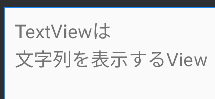
TextView
TextView は画面にテキストを表示するための View です。とても基本的な View ですが TextView クラスのソースは Android 9(Pie)の時点でなんと 12000 行以上もあります。
表示する内容はandroid:textで指定します。表示したい文字列を直接指定することもできますが、次の例のように
@string/文字列名
でリソースを使うようにしましょう。複数の言語に対応する際に役立ちます。
<TextView
        android:id="@+id/textView"
        android:layout_width="wrap_content"
        android:layout_height="wrap_content"
        android:layout_marginStart="8dp"
        android:layout_marginTop="8dp"
        android:text="@string/greeting"
        app:layout_constraintStart_toStartOf="parent"
        app:layout_constraintTop_toTopOf="parent" />
EditText と TextInputLayout
EditText はテキスト入力欄を作る View です。イマドキのヒント表示などが単体ではできないため、TextInputLayout と組み合わせて使用します。
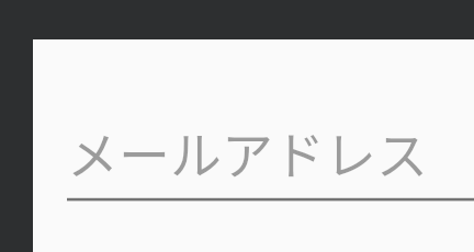
レイアウト XML では、次のように TextInputLayout と、その子に TextInputEditText をいれて使用します。レイアウトエディタで TextInputLayout をレイアウトに放り込むと、自動で TextInputEditText も追加してくれます。
<com.google.android.material.textfield.TextInputLayout
        android:layout_width="0dp"
        android:layout_height="wrap_content"
        android:layout_marginTop="8dp"
        android:layout_marginStart="8dp"
        android:layout_marginEnd="8dp"
        android:hint="メールアドレス"
        app:layout_constraintTop_toTopOf="parent"
        app:layout_constraintStart_toStartOf="parent"
        app:layout_constraintEnd_toEndOf="parent">

    <com.google.android.material.textfield.TextInputEditText
            android:id="@+id/email_edit"
            android:layout_width="match_parent"
            android:layout_height="wrap_content" />
</com.google.android.material.textfield.TextInputLayout>
Button
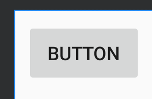
Button はタップ可能な見た目のボタンを表示する View です。ユーザーがタップしたときの処理を記述する方法は第9回の記事を読んでください。
<Button
        android:id="@+id/login_button"
        android:layout_width="wrap_content"
        android:layout_height="wrap_content"
        android:layout_marginStart="8dp"
        android:layout_marginTop="8dp"
        android:text="Button"
        app:layout_constraintStart_toStartOf="parent"
        app:layout_constraintTop_toTopOf="parent" />
FloatingActcionButton
FloatingActcionButton(FAB)は、ユーザーがその画面でもっとも頻繁に行うアクションを行うためのボタンを表示する View です。多くの場合、画面の右下に配置されていますが、詳細画面で「お気に入りに追加」のような場面ではヘッダー部分と本文の境界に配置されていることもあります。
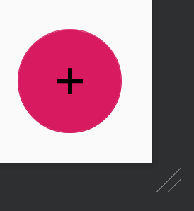
ボタンの背景色はテーマのaccent colorが使用されます。
<com.google.android.material.floatingactionbutton.FloatingActionButton
        android:id="@+id/fab"
        android:layout_width="wrap_content"
        android:layout_height="wrap_content"
        android:layout_marginEnd="16dp"
        android:layout_marginBottom="16dp"
        android:clickable="true"
        android:focusable="true"
        android:src="@drawable/ic_add_black_24dp"
        app:layout_constraintBottom_toBottomOf="parent"
        app:layout_constraintEnd_toEndOf="parent" />
ベクター画像を扱う
FABのandroid:srcではボタンに表示するアイコン画像を指定します。デザイナーさんに作成依頼をしてもよいですが、標準のものでよければ
Vector Asset を使う手もあります。
アプリに標準の Vector Asset を追加するには、Project の res フォルダあたりで右クリック →New→Vector Asset を選びます。
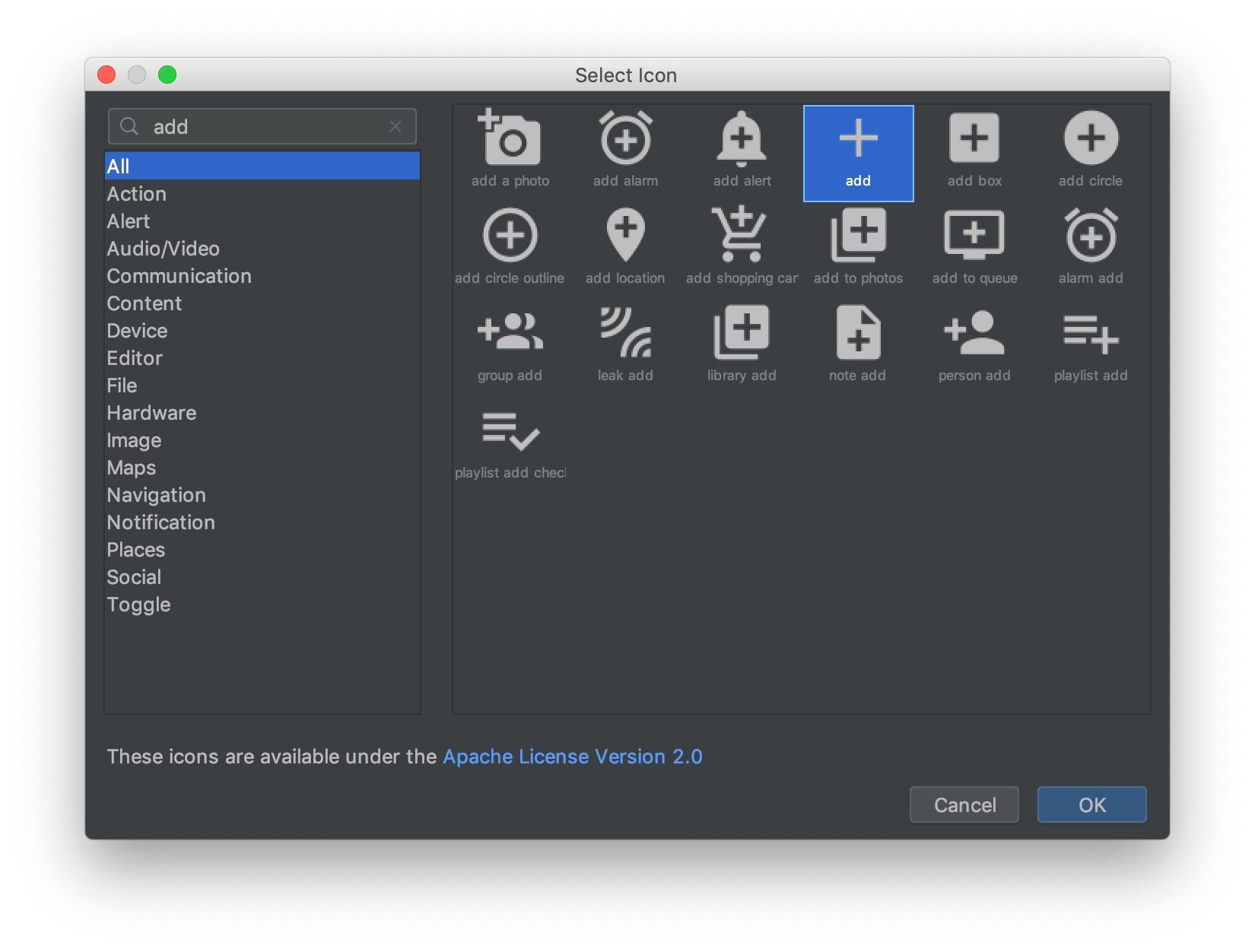
Clip Art のドロイド君の部分をクリックすると、アイコンが選べます。
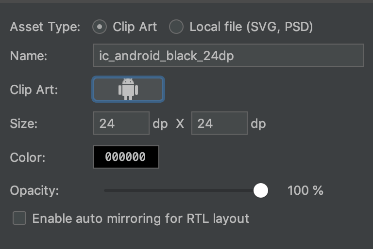
左上の検索欄をうまく活用し、追加したいアイコンを探します。
なお、ベクター画像は Android 5.0(API 21)以降で正式サポートされました。Android 4.4 以下ではライブラリを使えばベクター画像を使用することができます。
ImageView
ImageView は画像を表示するための View です。
View
のサイズをwrap_contentにした場合、実際の大きさは画像のサイズから決定されます。例えば横幅をwrap_contentとし、res/drawable-xhdpi
に幅 200x 高さ 200 ピクセルの画像(つまり、100dpx100dp)をいれた場合、View
の横幅は100dp になります。
<ImageView
        android:id="@+id/imageView"
        android:layout_width="wrap_content"
        android:layout_height="wrap_content"
        android:layout_marginStart="8dp"
        android:layout_marginTop="8dp"
        android:src="@drawable/moke"
        app:layout_constraintStart_toStartOf="parent"
        app:layout_constraintTop_toTopOf="parent" />
まとめ
Android アプリ開発でほぼ確実に使うと思われる View をピックアップして紹介しました。表現の幅を広げるためにも、実際に触って動作を確認してみることをおすすめします。